Visualizing the Singular Value Decomposition (SVD)

Introduction & Prerequisites
This post will require some understanding of Julia, matplotlib and Linear Algebra.
I’ve broken this blog into three separate parts, each focusing on a different element:
1) Some linear algebra knowledge that I think will be necessary.
2) The problem I’ve come up with
3) The visualization using Julia’s PyPlot package (which is built on the matplotlib package from Python)
The notebook I used for the code is available HERE if that is all you’re interested in.
The Singular Value Decomposition
The SVD is a common matrix decomposition method.
Matrix decomposition methods usually break single matrices down into a product of matrices, which offer advantages in a range of problems.
In the following explanation I’ll review some key ideas for the reduced SVD method (which differes from the full SVD method slightly).
Three matrices are produced with the SVD, U, Σ, and VT according to the following formula:
\begin{equation}
\label{eq:svd}
\mathbf{A} = \mathbf{U\Sigma V^T}
\end{equation}
where \(\mathbf{A} \in \mathbb{R}^{m \times n}\) represents the matrix (with rank \(r\)) which is broken down.
\(\mathbf{U} \in \mathbb{R}^{m \times r}\) contains the left singular vectors of A (left because it is on the left side in formula \eqref{eq:svd}), and similarly, \(\mathbf{V} \in \mathbb{R}^{n \times r}\) contains the right singular vectors of A.
Both the singular vectors in \(\mathbf{U}\) and \(\mathbf{V}\) are orthogonal to each other, respectively, and function as a new orthonormal basis for A.
\(\mathbf{\Sigma} \in \mathbb{R}^{r \times r}\) is a diagonal matrix, with the singular values of A in a non-decreasing order on its’ diagonal.
The singular values of A determine which singular vectors are the most important.
To explain the importance better, we can think of equation \eqref{eq:svd} a bit differently:
\begin{equation}
\label{eq:svd_rank1mats}
\mathbf{A} = \mathbf{U \Sigma V^T} = \vec{u}_1\sigma_1\vec{v}^{\,T}_1
+ \vec{u}_2\sigma_2\vec{v}^{\,T}_2
+ \ldots
+ \vec{u}_r\sigma_r\vec{v}^{\,T}_r
\end{equation}
where A is now decomposed into \(r\) rank-1 matrices (again, \(r\) is the rank of A) and the \(\sigma_i\)’s are the singular values and can be thought of a coefficients for each rank-1 matrix in equation \eqref{eq:svd_rank1mats}.
We call the components in Eqn. \eqref{eq:svd_rank1mats} “rank-1 matrices” because each component is a matrix produced by matrix multiplying two column vectors (although one is transposed) together, and column vectors have exactly a rank of one.
Conveniently, the SVD automatically sorts the singular values such that \(\sigma_1\) is the largest and \(\sigma_r\) is the smallest.
The SVD can be used in data compression using this fact, because one could get rid of the components with the smallest \(\sigma\)’s, knowing that when summing up the rank-1 matrices we’ve gotten rid of the least important components.
Now, I’ll convey a geometrical observation that was brough to my attention in Numerical Linear Algebra by Trefethen & Bau III 1 which will become important later on in this post:
To simplify this slightly (mostly because I don’t want to deal with m dimensional geometric shapes) lets write this for a m x 2 matrix:
In this context, the singular values, \(\sigma_1\) and \(\sigma_2\) (we only have two singular values if we assume we are working with a m x 2 matrix and the matrix isn’t singular) are the lengths of the principal semiaxes of the ellipse and the direction of the principal semiaxes are determined by \(\vec{u}_1\) and \(\vec{u}_2\) as we shall see later on.
With this knowledge, lets pose a problem and utilize the Singular Value Decomposition to get some insight into it and visualize the results!
John Baker the Apple Pie Maker
John is well known for his two apple pie recipes.
Both recipes use 3 Gregarious Green apples and 5 Reliable Red apples, which he gets from his apple trees on his farm.
John has 3 Gregarious Green apple trees and 5 Reliable Red apple trees, mimicking the number of apples needed in his two recipes.
His income consists of his apple pie profits and selling the excess apples which he doesn’t use in his baking.
Recently, the demand for his Gregarious Green apples has skyrocketed while he has been having problems selling his Reliable Red apples.
John wants to see whether he can reduce the amount of Reliable Red apples in his recipes and still have apple pies of a similar quality, so he can increase the number of Gregarious Green apple trees without increasing the Reliable Red ones.
John is an expert when it comes to taste, and he has been able to quantify the tastiness of the two apples in each of his two recipes. His trained tounge provides a continuous tastiness rating which will be of great help to us. Furthermore, John has been able to rate the quality of his apple pies as well.
Lets now set John’s problem up as a system of linear equations and introduce John’s ratings for his apples and pies:
\begin{equation*} t_{1,1}a_1 + t_{1,2}a_2 = q_1 \end{equation*} \begin{equation} \label{eq:syslineqs} t_{2,1}a_1 + t_{2,2}a_2 = q_2 \end{equation}
Here \(t_{i,j}\) is the taste rating of apple j in recipe i, \(a_j\) is the amount of apple j and \(q_i\) is the quality of recipe i. We can also write this in matrix and vector form for convenience:
\[\begin{bmatrix} t_{1,1} & t_{1,2} \\ t_{2,1} & t_{2,2} \\ \end{bmatrix} \begin{bmatrix} a_1 \\ a_2 \\ \end{bmatrix} = \begin{bmatrix} q_1 \\ q_2 \\ \end{bmatrix}\]or simply
\[\mathbf{T}\vec{a}=\vec{q}\]The taste rating John assigned to each apple for the recipes is
\[\mathbf{T} = \begin{bmatrix} 26 & 74 \\ 66 & 34 \\ \end{bmatrix}\]Before we continue, lets change variables slightly and work with changes in amount of apples, and changes in quality of the recipes.
\[\mathbf{T}\vec{a}^\ast = \vec{q}^\ast\]Now, \(a_j^\ast\) is the deviation from the number of apples (of species j) he used before, and \(q_i^\ast\) is the deviation in the quality of pie (from recipe i) from before. This allows us to monitor the changes in John’s current recipes rather than looking at the absolute number of apples in the recipes.
We can get all the information about the effects of changes in the recipes by looking at the matrix T using the SVD. Lets imagine that the change in the amount of apples is a unit circle in a 2-D plane. Now the observation I mentioned before becomes relevant because we know that when a unit circle is right matrix multiplied by a matrix, the outcome is an ellipse.
Lets now write up some Julia code, using the PyPlot package which is built on the matplotlib library:
Visualizing the SVD
All the code is written in Julia v.1.5.3 using the PyPlot package (along with some other minor packages).
Before we look at the visualization, lets define two helper functions:
1
2
3
4
5
6
7
8
9
10
11
12
13
function plot_singular_vectors(V_or_U, ax, width, head_length,
                            head_width, labels, label_dist)
    x_plot = V_or_U .- head_length .* V_or_U ./ norm.(V_or_U)
    ax.arrow(0, 0, x_plot[1,1], x_plot[2,1], width=width,
             head_width=head_width, head_length=head_length,
             fc="k", ec="k", zorder=10)
    ax.arrow(0, 0, x_plot[1,2], x_plot[2,2], width=width,
             head_width=head_width, head_length=head_length,
             fc="k", ec="k", zorder=10)
    x_label = V_or_U .+ V_or_U ./ norm(V_or_U) .* label_dist
    ax.text(x_label[1,1], x_label[2,1], labels[1], fontsize=10)
    ax.text(x_label[1,2], x_label[2,2], labels[2], fontsize=10)
end
We will use plot_singular_vectors to plot either the \(\vec{u}\) or the \(\vec{v}\) singular vectors as two arrows from the origin. The function aims to scale the arrows such that the arrow head doesn’t overlap with the unit circle or ellipse (depending on what subplot this function is called on).
1
2
3
4
5
6
7
8
9
10
11
12
13
14
15
16
17
18
19
20
21
function move_axes_to_origin(ax,
            axes_coords::Union{Missing, Array{Float64,2}}=missing)
    ax.xaxis.tick_bottom()
    ax.xaxis.set_ticks_position("top")
    ax.xaxis.set_label_position("bottom")
    ax.spines["right"].set_position("zero")
    ax.spines["right"].set_linewidth(3.5)
    ax.spines["left"].set_color("none")
    ax.yaxis.tick_right()
    ax.spines["top"].set_position("zero")
    ax.spines["top"].set_linewidth(3.5)
    ax.spines["bottom"].set_color("none")
    ax.set_axisbelow(false)
    ax.set_xticks([])
    ax.set_yticks([])
    if typeof(axes_coords) != Missing
        @assert length(axes_coords) == 4 && size(axes_coords) == (2,2)
        ax.xaxis.set_label_coords(axes_coords[1,1], axes_coords[1,2])
        ax.yaxis.set_label_coords(axes_coords[2,1], axes_coords[2,2])
    end
end
move_axes_to_origin shifts the x- and y-axes such that they cross at the origin. In addition, the function removes the box around the plot and moves the label location.
Now lets write a function that visualizes the change in the amount of apples, which we are going to interpret as a unit circle:
1
2
3
4
5
6
7
8
9
10
11
12
13
14
15
16
17
18
19
20
21
22
23
24
25
26
27
28
29
30
31
32
33
34
35
36
37
38
39
40
41
42
function plot_apple_unit_circle(ax, T::Array{Float64, 2}; N::Int=250)
    # Lets first grab the `hsv` colormap from the matplotlib package
    #  and normalize it using `vmin` and `vmax`
    # set_array([]) is an obscure trick which allows me to use
    #  the colormap properly for some reason
    cnorm = PyPlot.matplotlib.colors.Normalize(vmin=0, vmax=2*π)
    m = plt.cm.ScalarMappable(norm=cnorm, cmap=plt.cm.hsv)
    m.set_array([])

    # Next, we'll create coordinates for a unit circle.
    #  We choose `N=250` coordinates to make the circle look nice.
    θ = range(0, stop=2*π, length=N)
    a = transpose(hcat(cos.(θ), sin.(θ)))

    # This for loops iteratively plots a line between any two
    #  points in `a` and assigns a color chosen from `m`
    for i = 1:length(θ)-1
        ax.plot([a[1,i], a[1,i+1]], [a[2,i], a[2,i+1]], lw=8, c=m.to_rgba(mean(θ[i:i+1])))
    end

    # The LinearAlgebra library in Julia has a simple SVD function.
    # F is the factorization of T and contains all
    #  matrices (U, V, Sigma)
    F = svd(T)

    plot_singular_vectors(F.V, ax, 0.02, 0.1, 0.1,
        ["\$\\mathbf{v}_1\$", "\$\\mathbf{v}_2\$"], 0.2)

    # We'll use our helper functions to plot the
    #  left singular vectors, and move the axes

    move_axes_to_origin(ax, [1.01 0.56; 0.54 0.97])

    # Finally we'll add some labels and tick markers
    ax.set_aspect("equal")
    ax.set_xlabel("\$\\vec{a}_1\$", fontsize=14)
    ax.set_ylabel("\$\\vec{a}_2\$", fontsize=14, rotation=0)
    ax.set_xticks([-1, 1])
    ax.set_xticklabels(ax.get_xticks(), fontsize=12)
    ax.set_yticks([-1, 1])
    ax.set_yticklabels(ax.get_yticks(), fontsize=12)
end
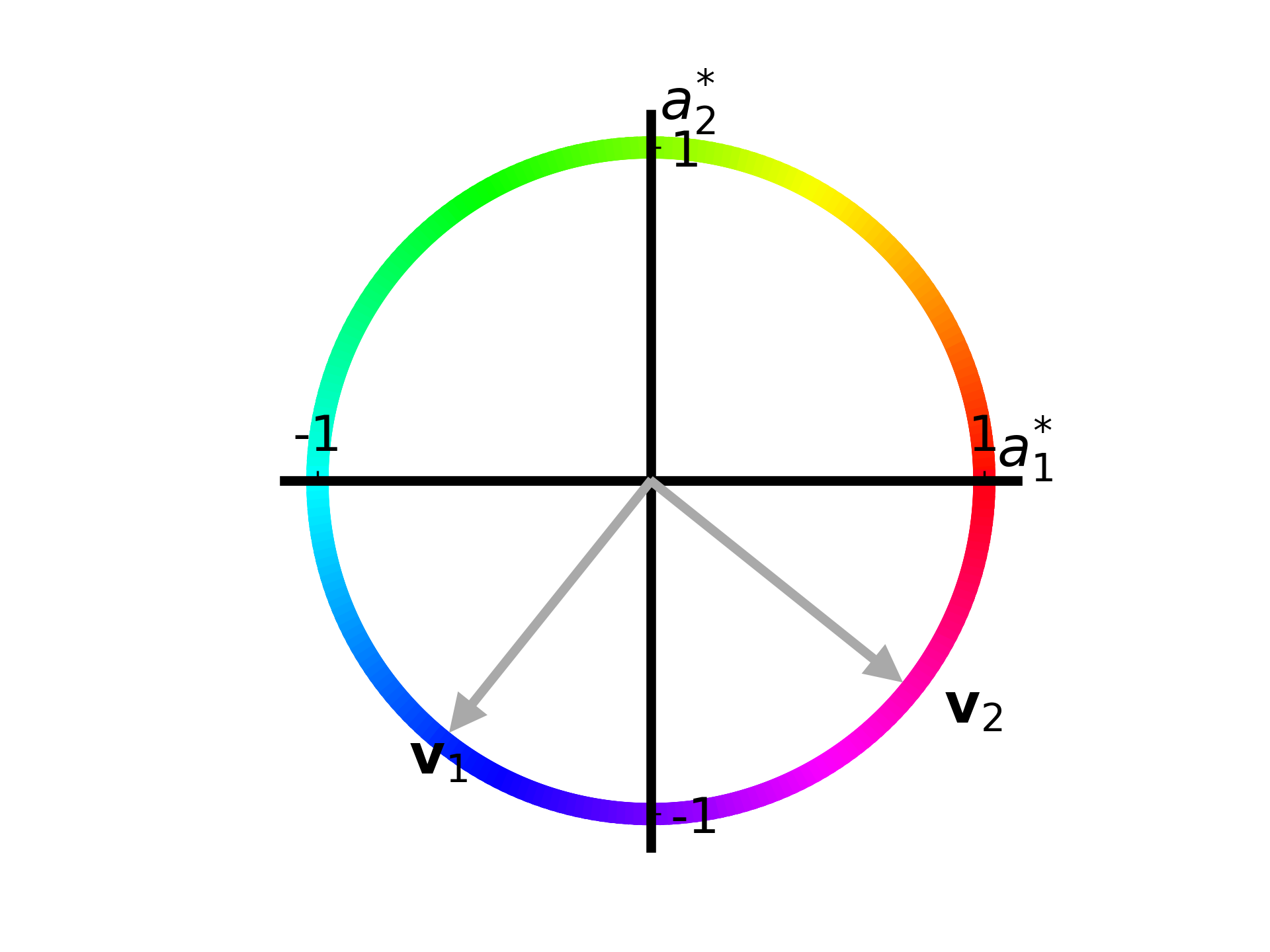
Lets see the outcome after running the function on T:
fig, ax = plt.subplots()
T = [26. 74.; 66. 34.]
plot_apple_unit_circle(ax, T)
The coloring on this circle is not an obvious choice as of now, but when we see how the unit circle is mapped to an ellipse it will make more sense.
The figure shows a unit circle describing the change in amount of apples. Lets say that the change in Gregarious Green apples is described by \(a_1^\ast\) and the change in Reliable Red apples is described by \(a_2^\ast\).
At \([1,0]\), or on the point where the circle crosses the right side of the horizontal axis, the amount of Gregarious Green apples has increased by one while the amount of Reliable Red apples hasn’t changed at all.
We also see the right singular vectors, \(\vec{v})
Now lets write up a function that takes the unit circle and maps it to an ellipse using T:
1
2
3
4
5
6
7
8
9
10
11
12
13
14
15
16
17
18
19
20
21
22
23
24
25
26
27
28
29
30
31
32
33
34
35
36
37
38
function plot_quality_ellipse(ax, T::Array{Float64, 2}; N::Int=250)
    # We will use the same exact colormap because the colors will
    #  correspond to each other on the unit circle and the ellipse
    cnorm = PyPlot.matplotlib.colors.Normalize(vmin=0, vmax=2*π)
    m = plt.cm.ScalarMappable(norm=cnorm, cmap=plt.cm.hsv)
    m.set_array([])

    # We define `a` again and now calculate `q` by matrix
    #  multiplying `a` with `T`
    θ = range(0, stop=2*π, length=N)
    a = transpose(hcat(cos.(θ), sin.(θ)))
    q = T * a

    for i = 1:length(θ)-1
        ax.plot([q[1,i], q[1,i+1]], [q[2,i], q[2,i+1]], lw=8,
                 c=m.to_rgba(mean(θ[i:i+1])))
    end

    # Now we wish to plot `u_i * sigma_i` rather than `v_i`.
    # In the context of an ellipse, `u_i` point toward the
    #  principal semiaxes of the ellipse and
    #  `sigma_i` is the length of those principal semiaxes.
    F = svd(T)
    Uσ = F.U .* [F.S[1] F.S[2]; F.S[1] F.S[2]]
    plot_singular_vectors(Uσ, ax, 1.0, 9.0, 9.0,
        ["\$\\mathbf{u}_1\$", "\$\\mathbf{u}_2\$"], 15.))

    # And like before, we move the axes and
    #  add some labels to the plot
    move_axes_to_origin(ax, [1.01 0.58; 0.54 0.97])
    ax.set_aspect("equal")
    ax.set_xlabel("\$\\vec{q}_1\$", fontsize=14)
    ax.set_ylabel("\$\\vec{q}_2\$", fontsize=14, rotation=0)
    ax.set_xticks([-50, 50])
    ax.set_xticklabels(ax.get_xticks(), fontsize=12)
    ax.set_yticks([-50, 50])
    ax.set_yticklabels(ax.get_yticks(), fontsize=12)
end
Now lets plot both the unit circle and the ellipse on one figure according to T:
# The gridspec_kw moves the top and bottom margin in this case
fig, axs = plt.subplots(nrows=1, ncols=2, figsize=(11, 5),
            gridspec_kw = Dict("top" => 1.0, "bottom" => 0.0))
# note that because we have `ncols=2` now, `axs` becomes
#  an array of two `ax` objects
plot_apple_unit_circle(axs[1], T)
plot_quality_ellipse(axs[2], T)
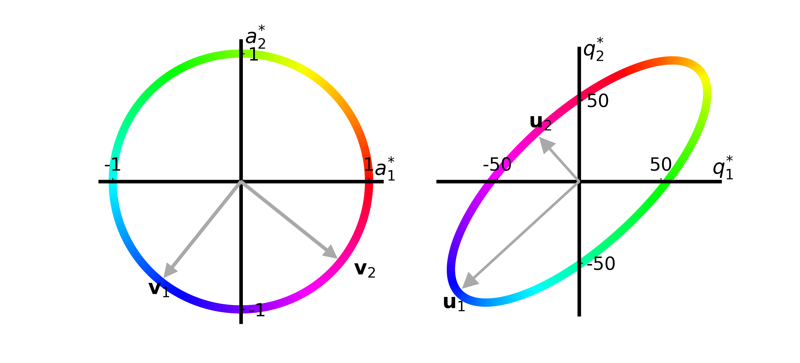
Now the color coding hopefully makes more sense.
Each color on the unit circle is mapped to the same color on the ellipse.
If we look at the purple color which \(\vec{v}_2\) points to on the unit circle, representing an increase in the amount of Gregarious Green and an equal decrease in Reliable Red apples, we see that the purple color on the ellipse shows that the quality of recipe 1 (\(q_1\)) decreases while the quality of recipe 2 (\(q_2\)) increases.
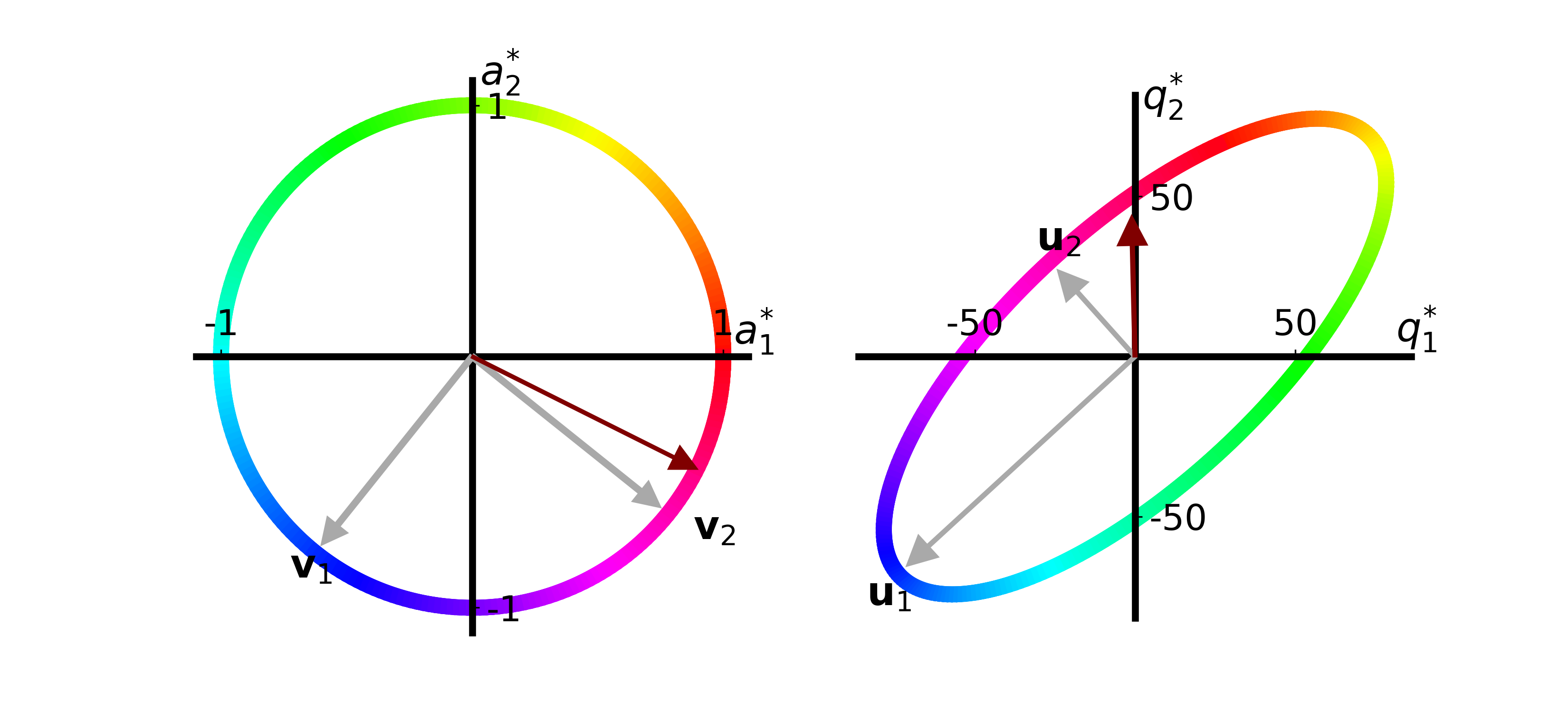
John is very interested in decreasing the amount of Reliable Red apples in his recipes by 2 and increasing the amount of Gregarious Green apples by 4. We can think of this change as the vector \(\vec{a}^\ast = [4.0, -2.0]\), which we can normalize and place on the unit circle:

John’s proposed change is now illustrated as a maroon arrow. We can see that the effect John proposed increases the quality of recipe 2 but has no effect on recipe 1.
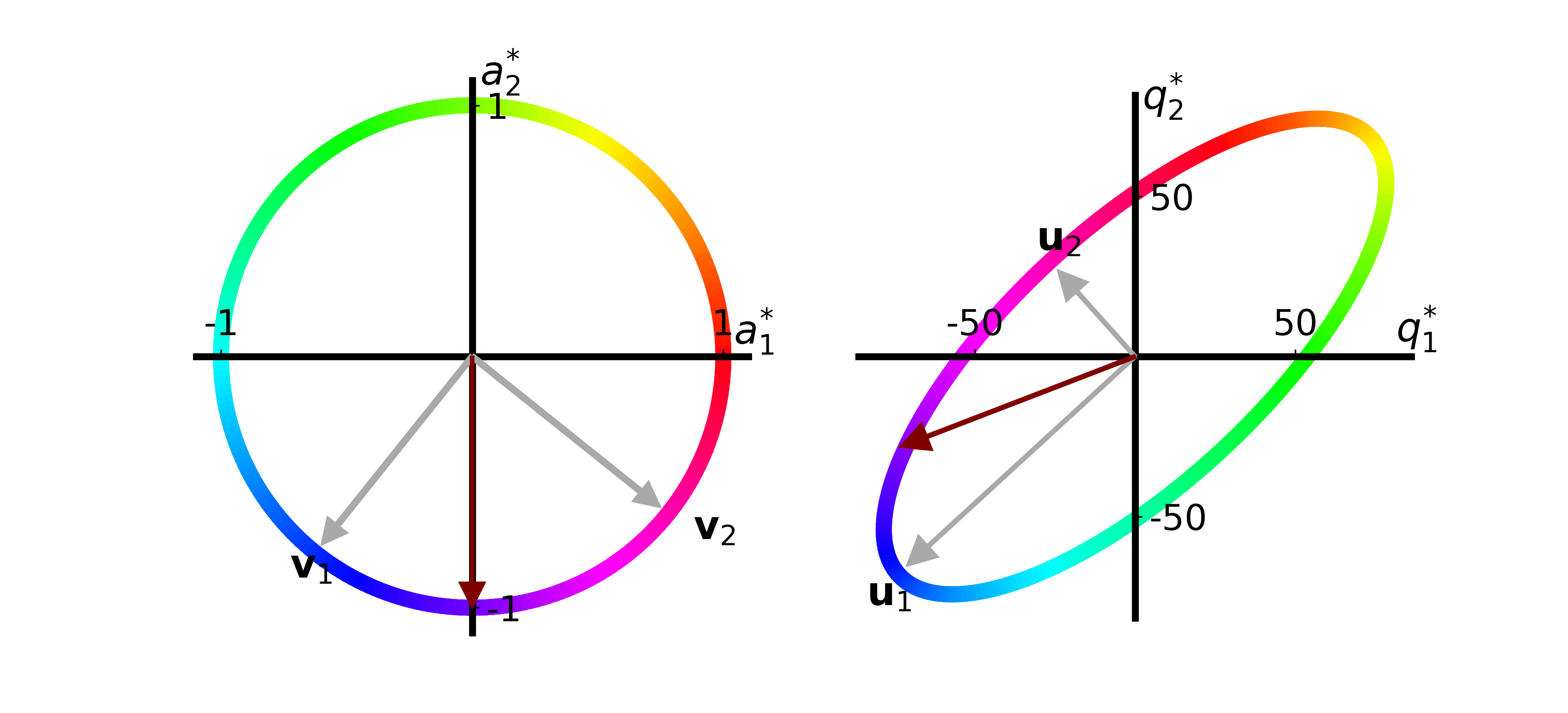
Another idea John had was to decrease the amount the number of Reliable Red apples while keeping the number of Gregarious Green apples the same:

We see that only decreasing the amount of Reliable Red apples decreases the quality of both recipes!
John is now pretty sure he’ll be able to use this SVD framework to analyze if he can change his recipes slightly while keeping the quality of his pie recipes consistent.
The notebook for all of the code can be found HERE.
Final Words
The Singular Value decomposition is a very powerful tool, and this is only one way I’ve thought of to interpret and visualize the results.
This post is heavily inspired by an article I wrote when in dr. Cory Simon’s lab at Oregon State University2, in which this same interpretation was used to analyze the effectiveness of sensor arrays with metal-organic frameworks (MOFs).
The visualizations went one step further than what I’ve shown here, so if you’re interested in more ideas on how the SVD is applied, please take a look at that paper.
Another aspect I looked at in the paper was the concept of the condition number of the matrix, which is outside of the scope of this blogpost.
We published the code used for the paper on Github, and the link can be found in the article.